The Good, The Bad, And The Ugly
I can dish it out, but can I take it? Sure. Come along with me while I take you
on a tour of some of my composition jobs, both embarrassing and encouraging.
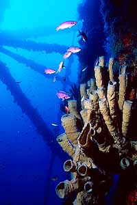 |
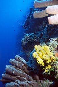
One of my favorite pictures from year 2000, and
mostly due to composition. This one employs several compositional
elements that work together. First, the main subject (the sponges,
but I probably didn't need to tell you that) is "on the
thirds" in the lower right corner, with plenty of blue water
elsewhere. As if that weren't enough, the subject is framed two
different ways by the legs of the oil rig. The lines of the rig
struts diverging from the left-hand side of the frame tend to lead
your eye towards the sponges, framing up the sponges between two of
the larger struts. Then the two vertical rig legs on the right
diverge from the top, framing the sponges inside the triangle they
create.
Add to that the leading lines of the rig struts going the
other way, towards the left, and you get a highly dynamic
composition that makes the sponges jump out of the frame and then
leads your eye out of the frame. You can't help but wonder what
happens at the intersection point!
Verdict: Good.
|
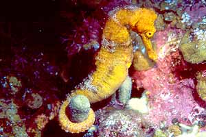
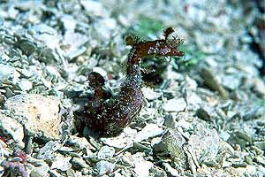
| Um, well, this one is not so good. The basic problem
is that the subject is mostly vertical, but the picture is not. This
one should have been shot in a "vertical" orientation.
Unfortunately, my macro setup it makes it very difficult to do this,
so I figured I'd just shoot it horizontal and then re-frame it by
cropping this image. This sort of thing is pretty easy to do, even
in the darkroom, and without much loss of image quality. But I made
a mistake: I didn't leave enough space above and below the seahorse
to maintain the proper aspect ratio after re-framing.
Oops. Oh well, that's what mattes are for, right? Sigh.
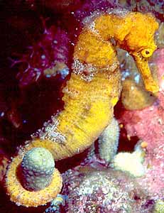
For reference, here's how the picture looks after cropping to a
vertical format. In this format, you see what happens: the seahorse
takes on a diagonal line, and the eyes & tails are near the
thirds. If I had left some more vertical space around the head &
tail when I framed it, I could have cropped this to put the eye and
tail on the thirds. Close, but no cigar.
Verdict: Bad.
|
|
 |
Normally I'd say that centering the subject is a
really bad thing, but this picture has something else going for it.
The twin diagonal lines of coral running above and below the subject
create a dark diagonal band which surrounds the subject and makes it
stand out. That's enough (for me) to overcome the centering problem
and salvage the picture.
Verdict: Good.
|
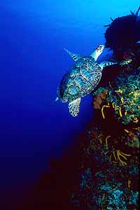
| Score! Subject on the thirds, diagonal line, pleasing
body position by the subject, and a couple of 'extras' make this one
a direct hit in terms of composition. Usually it's better to place
your subject on a third so it is swimming into the frame rather than
out of it. However, most people will tell you that positioning the
subject so that it is swimming out of the frame brings a feeling of
escape or flight (as in 'running away'), and that's exactly what it
does here. With the bright water overhead and the turtle leaving the
frame upwards, there's a great feeling of the turtle heading to the
light, to the surface. That's the 'extra' I mentioned above.
The only thing I can think of to improve this picture would be to
have shot it from slightly farther to the right, to separate the
turtle from the reef a little. Minor issue, though, and I like this
picture a lot.
Verdict: Good.
|
 |
|
Yuck. This one is so cluttered that you can barely
tell what the subject is. Centering is bad enough, but there's
garbage behind it, and the pebbles are really distracting. I should
have gotten lower (if that were possible) to try to separate the
subject from the clutter. As it is, this one is almost a
complete loss.
Verdict: Ugly. |
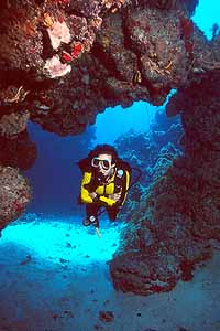
| Woohoo! This picture shows another case where
centering is not always bad. In this case, the swimthrough and its
odd lighting effects overpower the centering, and highlight the
subject. This is also a rare case where the diver is the
subject, not just an accessory.
The lighting here is what's critical in terms of composition. If
you're shooting a swimthrough and you want to show that it's not a
tunnel, you have to get some water overhead or next to it. In this
picture, the water in the upper right gives the viewer a clue as to
the extent of the swimthrough, and also puts the bright patch of
sand in the center-left in an understandable context. The three
together, with the diver hovering mid-water, give this picture a 3-D
effect which makes the subject seem to loom large.
Verdict: Good.
|
 |
 |
Classic composition is the name of the game in this
picture. Diagonal lines go top-right to bottom-left, with subjects
on every third other than the top left one. I wish the top-right
sponge were a little darker, but if you were having a print made,
that could be burned in a little.
It's hard to say what "the" subject is in this picture
because something occupies almost every third. That's ok, though,
because all three subjects are sponges, so it doesn't really matter.
However, the yellow sponge points in a line perpendicular to that of
the reef, and has a color that draws your attention to it, so it
moves to the head of the line as the thing your eye is going to
settle on. If I could have posed a shark at the fourth 'third'
point, that would have been a primo A-#1 composition job. Too bad
sharks aren't known for cooperating with photographers. :)
Verdict: Good.
|
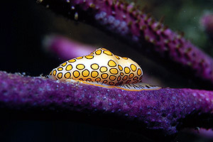
| Generally a terrible composition job. The subject is
centered, there's this huge, flat, horizontal line running through
the picture, and the flamingo tongue's mantle is tantalizingly
not-quite-visible. About the only thing good in this picture is the
color arrangement. Fixing this one would have been easy: rise up a
little, so you could see the mantle, and then rotate the camera 45
degrees so the sea rod presented a diagonal line, and I would have
had an interesting picture of an interesting subject.
Verdict: Bad.
|
 |
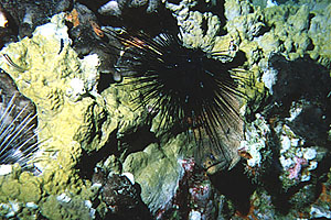 |
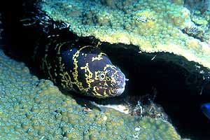
Can you even find the subject in this picture? It's
way too busy, between the fire coral, the urchins, and the rocks.
Our subject (hint, look down and to the right from the black urchin)
is lost in a sea of distracting elements. The only salvation for
this picture would have been to close in on the moray & black
urchin in order to (a) make the eel larger, and (b) remove some of
the other interfering elements.
Verdict: Ugly.
|
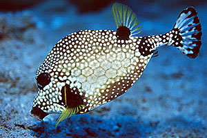
| Classic fish-portrait composition plus a little
artistry, and nothing to complain about. The eye is on a
third, the subject occupies a majority of the frame, and in an
interesting twist, the subject itself supplies a diagonal line. You
can't ask for much more than that in a fish portrait!
Verdict: Good. |
 |
|